Clan United got the enviable challenge of creating a bold, modern logo to represent Berwick Rangers FC’s progressive ambition as part of their ‘New Decade, New Goals, New Berwick Rangers’ campaign. One of the core aims of the club, was to establish a Charity Foundation to give back to their local community.
Initial Scope
To kick-start Clan United, we aimed to produce notable work within the industry and decided to start locally with a project based in Scotland. First, we researched various football clubs and drew potential ideas for branding or marketing projects. Upon multiple candidates, we decided to focus on Berwick Rangers Football Club (BRFC) as they are a club with a strong identity and history, and fuelled with loyal support from fans, players, and club staff. Their aforementioned ‘New Decade, New goals, New Berwick Rangers‘ campaign showed keen promise that aligned with what Clan United aims to do- drive the sport forward.
Design Sprint
A design sprint is a useful tool for agencies, and clients, to discover likely success routes and untapped potential. On this occasion, we decided to prepare a case study of the club and present a rounded idea to the club when initiating contact.
Our main focus, was quickly centered around the core aspect of any football club identity – the club badge.
The BRFC badge features the town crest, with both a rampant lion to represent Scotland and a guardant lion to represent England. Being the only club in Scottish football to be from outside Scotland, BRFC are immensely proud of their unique membership from England.

Unbeknownst that BRFC had a foundation in planning, we decided to give the club crest a modern rebrand that would keep the club identity strongly intact whilst showing the club ambition to progress forward in the new era of modern football.
Our Badge Redesign
Keeping the main elements, including the circular shape, thick bold font, and lions to accompany the crest; We produced a modern re-imagination of the badge for the new era of BRFC.

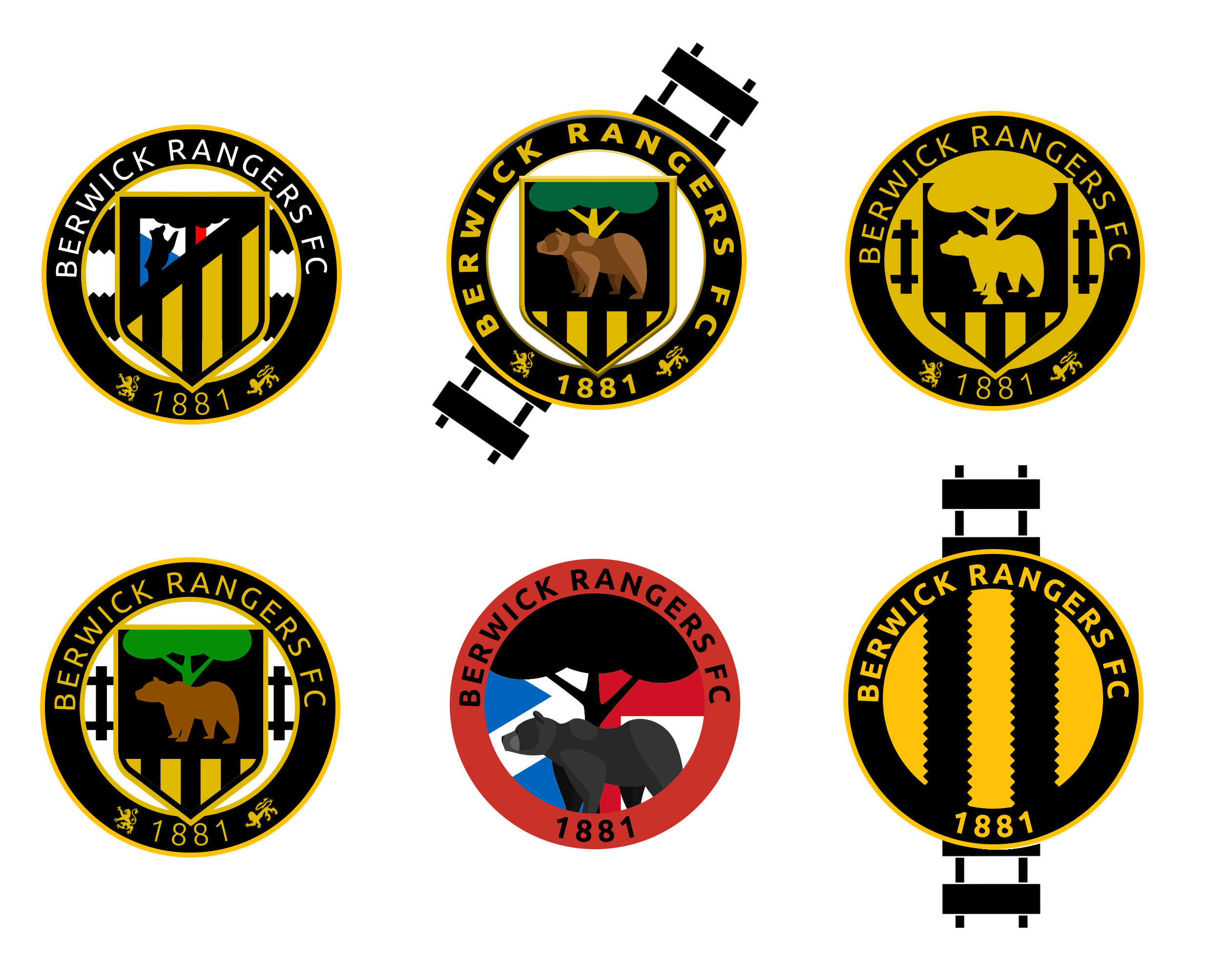
Of all our designs, one in particular stood out.
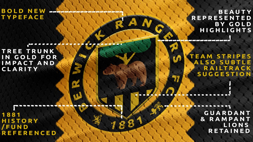
As dissected in the image above, we were able to create a stylish badge that kept the original ethos and also breathed the life of the football club throughout its entirety. The addition of the iconic gold and black stripes from the BRFC home strip also gave a subtle nod to the railwaymen involved in the original club conception in 1881.
Before creating any designs, we’d researched and established a set direction for the badge to ensure we were working towards the appropriate ethos and representation of the club. We identified that an ideal brand identity would encapsulate the club as Unique, Historic and Glorious. As part of the pride for the historic town comes from the beauty of the landscape and architecture, the obvious choice was to utilise gold and black throughout the whole design to give a premium vibe to the end product.

From our suggested design, we provided multiple considerations to ensure the club had creative input and could understand the design direction we had worked through. For example, choosing whether or not to have a solid background around the shield shaped pendant gives the design a different feeling. Also, showing a comparison of white text (as with the current badge) and the recommended gold text, adds an extra element for artistic debate. Whilst the white text ‘pops’, we felt the gold kept the design more stylish and premium.

To help with visualisation, one of the most important usages of a football badge is on the home strip. The game is built upon the players representing a team in branded uniform, and with some insight from the board we were able to mock-up Kappa kits ahead of the announcement of their new kit sponsor. Seeing how the transparent inner background could interact with different strip styles help us efficiently size the design for usage.

The next intuitive step, was to work through how our design would be used across various mediums and help create potential usage guidelines to keep a strong core brand voice. Aside from the usual guidelines that would state not to skew, distort or discolour a brand, we worked with a colour scheme and general ideas to ensure that any future designer would be able to use the brand to its full potential. This included stating font choices and characteristics for consistency.


Club Feedback
Upon receiving our pitch, we gained positive feedback from the BRFC board, and an excited discussion took place for many weeks. Due to the global COVID-19 pandemic, and timing of the pitch, it was eventually concluded that it was not the ideal moment to rebrand the entire club but that there was interest to use the design in some near-immediate way.
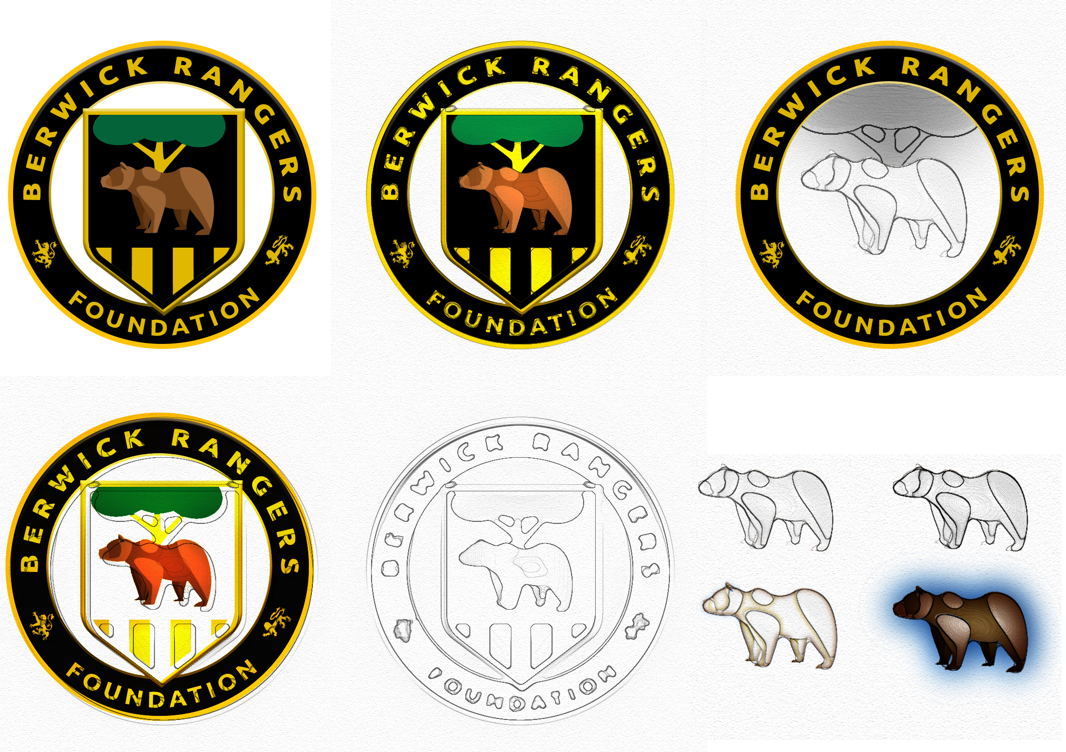
After initial discussions about various branches of the club, including the recent announcement of BRFC juniors rejoining club activities, a request was made for Clan United to revamp the design for the upcoming Berwick Rangers Community Foundation (BRCF) launch.
Berwick Rangers Community Foundation
Charities are becoming encouragingly more commonplace within the sport, and many football club charities have had great inspirational achievements. This arm of corporate social responsibility is often handled transparently by firstly branding the charity as part of the club then almost counter-intuitively forming a barrier between the club and charity in terms of management and influence. The reasoning for this, is to ensure the charity is able to focus all efforts towards meeting their goals, without any clashes of interest in terms of funding and outcomes.
BRCF wanted their strong roots within Northumberland to be prevalent in their branding, which also married up with the 2020/21 BRFC away kit design, featuring the Northumberland flag colours.

Having done the initial designs based on the BRFC identity, revamping the design became fairly straight forward. Firstly, the consideration was to use the new badge proposal as it was, with accompanying text banners. After various versions, a strong contender emerged by making simple tweaks to the design to re-purpose it for the charity.

The repurposed logo is currently due to appear on the BRFC third strip, due to print in September and available to pre-order today from the club website. More information on Berwick Rangers Community Foundation can be found via their website.
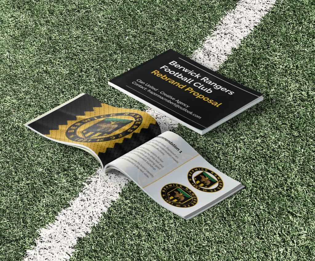
For a full look at our club rebrand proposal, please get in touch.
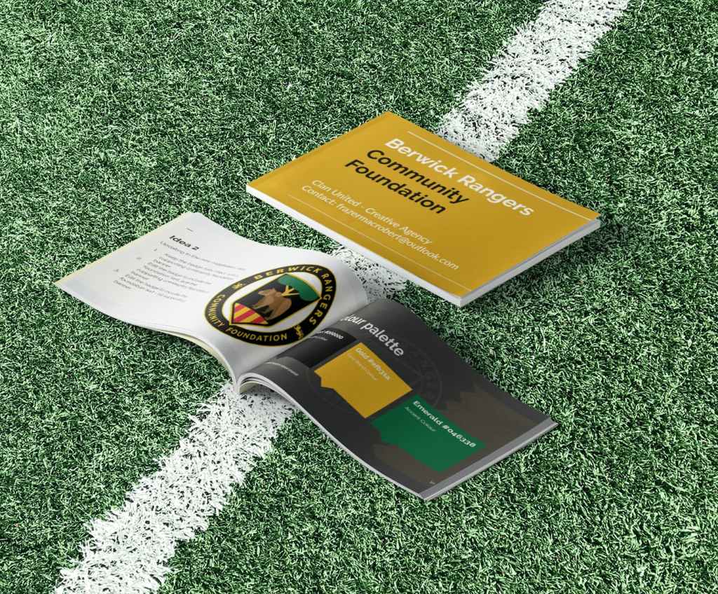
For a detailed look at the Community Foundation proposal, please get in touch.
For any enquiries into branding, rebranding, design workshops, marketing functions, media content or for anything not listed, feel free to get in touch via our contact page.
Additional Ideas
When designing, it is important to explore multiple possibilities no matter how much enthusiasm you or your team have for the core concept. One major reason for this, is the truly subjective viewpoints on what is aesthetically pleasing or superior for any given brand. When pitching to a well established football club there are many stakeholders to consider, and simply wearing a ‘graphic designer hat’ may not satisfy the passion and loyalty behind existing ideas already in a club.
When pitching our suggested badge, we also included multiple other design ideas to help fuel discussion and direction on the project. Whilst on this occasion, it helped cement the favoured route, multiple ideas can allow a client to mix and match elements of a design or perhaps be inspired for a new path to be explored.
Here are some routes that were not developed further:


One Comment
Comments are closed.