
Working in the heart of Phnom Penh, Cambodia, allows the luxury of immersing in the Metfone C-League. Cambodia’s premier league isn’t well documented overseas, through a severe lack of international journalism and media assets. Of the 13 teams in the league, the majority play in-or near-Phnom Penh. Given the obvious opportunity, Clan United researched the various local teams and chose a club filled with the potential for exciting HCD development.
(Khmer Version of this pitch available by clicking here)
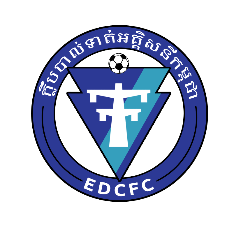
Electricite du Cambodge Football Club, makes its link to parent company ‘Electricite du Cambodge’ extremely apparent by displaying two electricity pylons over the top of football. The logo outline follows the same style, and navy blue and white colour scheme of the EDC company logo.

The EDC is a wholly state-owned limited liability company to generate, transmit and distribute electric power though-out Cambodia.
As a young club (founded 2015), retaining a close, obvious tie to EDC is important. When building a brand, it’s always important to have a clearly defined brand essence, brand mission and to allow the brand to be accessible to potential fans. Cambodia has a strong community culture, which favors businesses that can demonstrate their CSR. With EDC well known for the electrical services and work throughout the country since the turn of the 20th century, it was therefore important to ensure that any rebrand designs acknowledged this heritage and namesake significance.
The Aesthetic Approach
We began by dissecting the current EDCFC logo, and highlighting the potential pain points. The concept was strong, but the black pylons involved a lot of intricate details that were unfavorable for printed designs or smaller digital placements. We wanted to be able to display a similar visual message, in a cleaner, bolder, and minimalistic manner- as is very much increasingly popular in international football crest rebrands.
Next, we examined the effectiveness of the football within the crest. Whilst there was temptation to remove it entirely, it serves a clear purpose to differentiate between EDC and EDCFC as there could potentially be branding confusion in the future as search engines fill up with similarly tagged keywords triggering both brands. The simple inclusion of a football, quickly conveys the EDCFC brand as a football club rather than an electric company.
The light blue colour within the football is used as the club’s home colour, so we wished to find a way to retain this within the new design- whilst keeping the overall design orderly.
Lastly, we explored various options to include Khmer text for the clubs proud national identity, but equally giving importance to retaining the English ‘EDCFC’ or Electricitie du Cambodge Football Club, to keep the design accessible to a global audience.
First Considerations


Bold, simple and clean. We portrayed the pylon in a simple, recognizable manor that would be easy for any printed assets. Next, we made the decision to remove the football from the background of the design, and give it pride of place within the top and center of the visual canvas.
To reflect the simple blue and white EDC crest, we wanted to keep the pylon as white – therefore we needed to surround it with a dark backdrop. Given the ‘electricity theme’, we created a crest shape with a subtle nod towards a lightning bolt, combining the jagged bolt shape symmetrically to create a bold triangular arrow head shape. Firstly, we presented it within the existing circular badge shape, limiting the design colours to navy blue and white – with a crisp black outline.
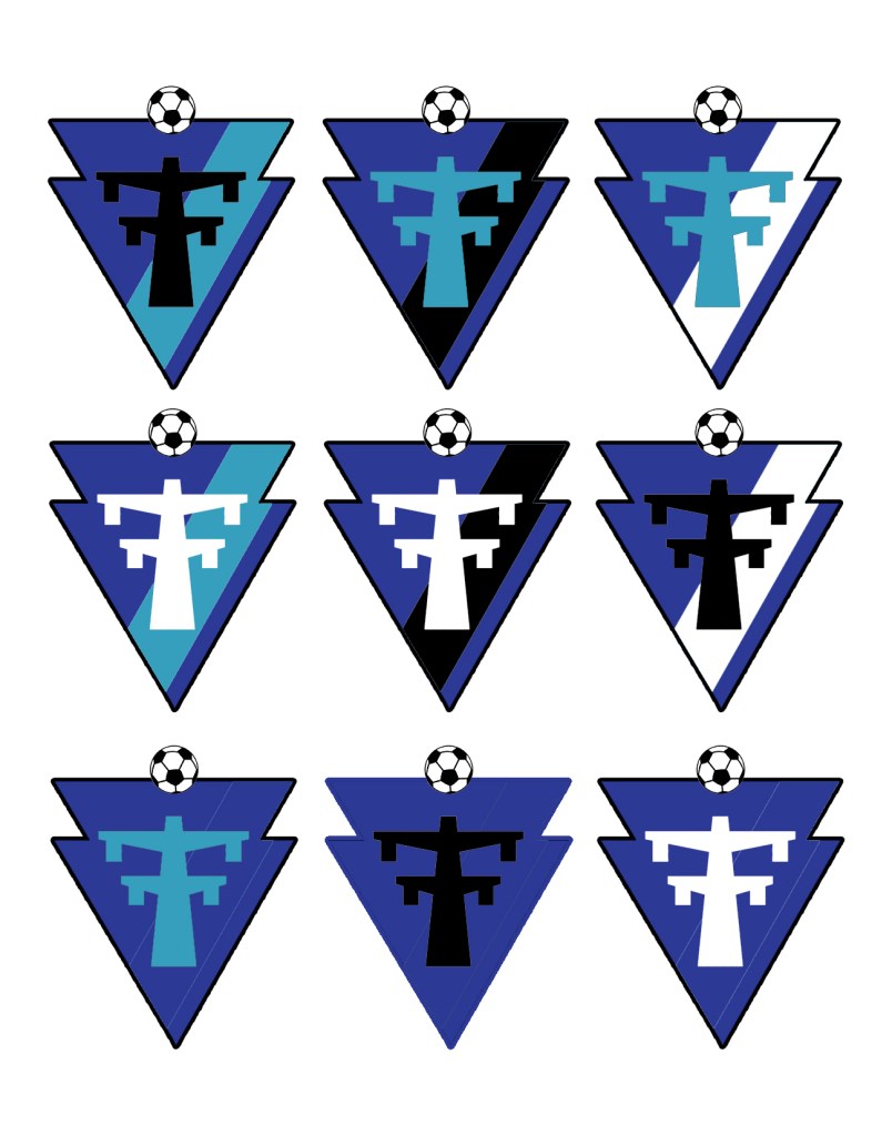
Our second development, was to consider a more unique presentation, by letting the arrow head shape stand alone unframed, with a single light blue stripe added to reflect the clubs home strip colour. This design was accompanied by text centered underneath the logo, yet would be able to powerfully stand alone in various design usages.
Finalised Recommendation
By marrying the strongest features of both design adaptions, we created a strong design pitch to present to EDCFC.
Whilst we highlighted the potential for the inner ‘lightning bolt’ crest as a usable standalone asset, the surrounding circular border is both a traditional, and practical solution for any football club. We wanted to create a harmonious transition between the current design and our pitch, so that fans would largely adapt and support the change instantly.
For the ‘standalone logo’, we explored various colour schemes to help us identify the strongest route for the club.
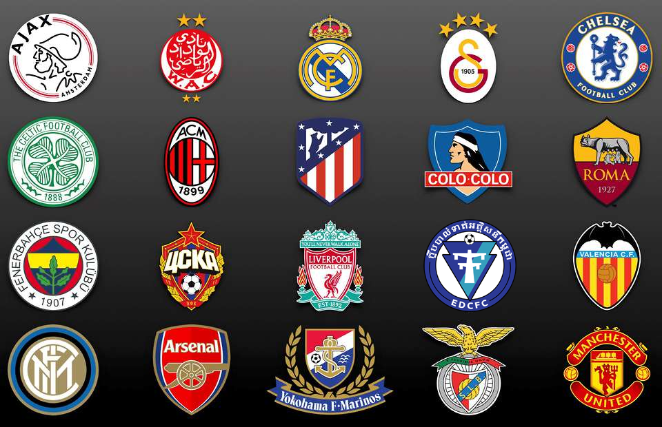
Comparisons can be useful, as although clubs may wish to stand out and move in a new innovative direction, there can be a general zeitgeist for football crest designs. By putting our pitched design amongst a diverse range of global crests, we were able to confidently convey that the EDCFC badge could compete aesthetically alongside many established brands – without merely being a carbon copy of an existing club.
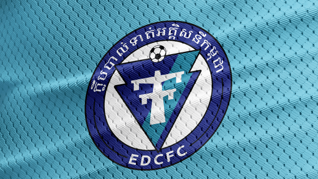
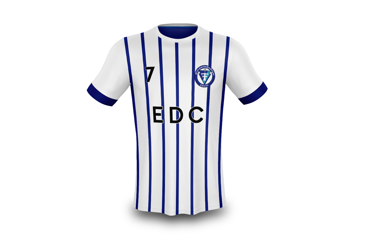
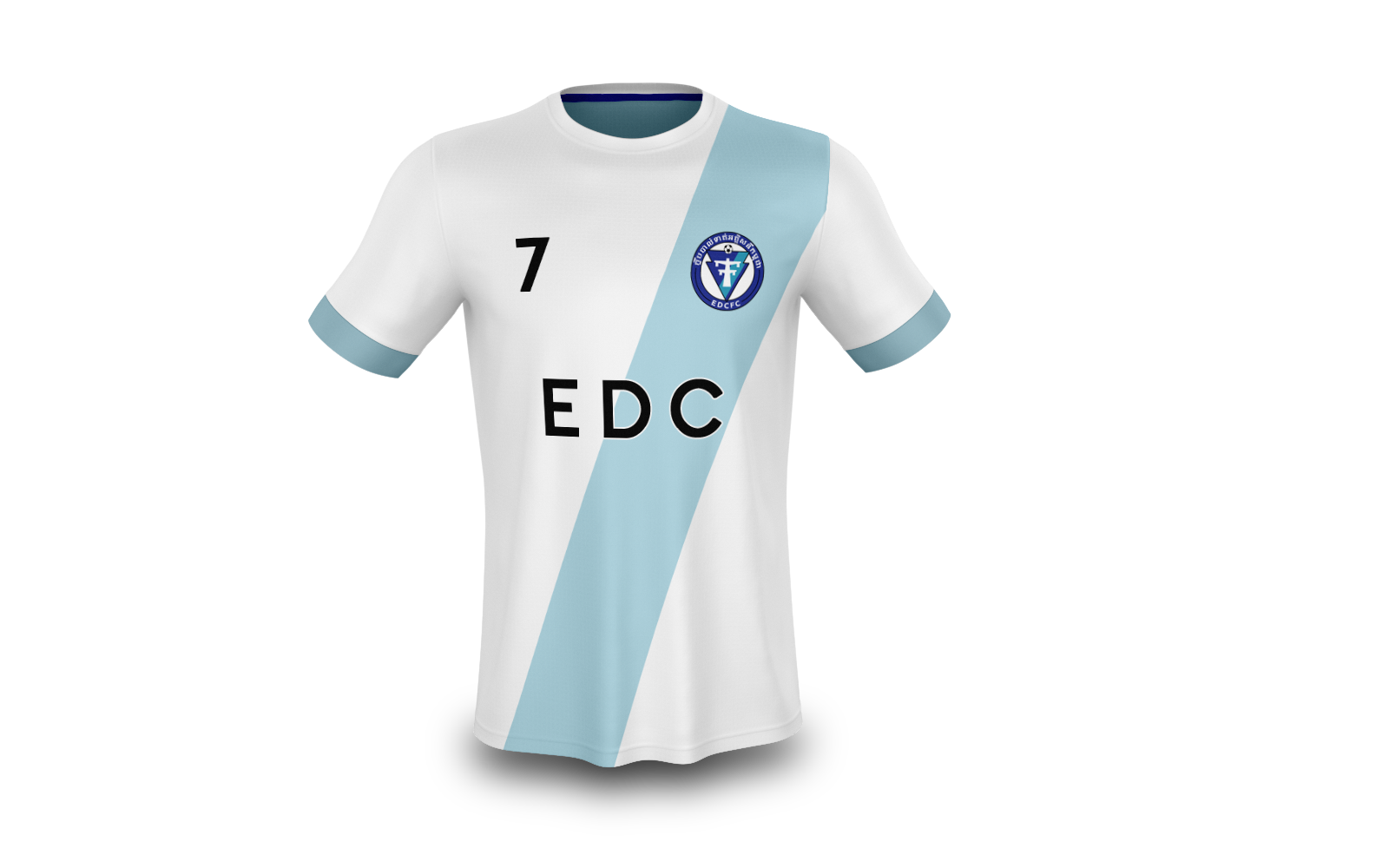
As always, to bring a concept to life, we tested the badge on various concept kit designs.


One Comment
Comments are closed.