While being based in Phnom Penh, Cambodia, it’s great to immerse in the local football leagues. The top tier of Cambodian football is the Metfone C League which currently (2021) has 13 teams.
To keep Clan United’s design thinking sharp, it’s great to analyse local clubs and consider potential rebranding opportunities.
After 5 games in the 2021/22 Kirivong Sok Sen Chey F.C. caught our eye.
Kirivong Sok Sen Chey F.C. Rebrand
The club is relatively new, having only been formed in 2016. Yet, by 2019 the club had already performed a much needed crest brand to update the professionalism of the team.

The 2016 crest was extremely busy… and oddly featured photography in the design. A cartoon dragon was placed over the top, with two 3D styled footballs at the side. The lines for the circles that housed the crest were jagged and pixelated in most use cases.
It felt like the club crest was either an after-thought or a quick prototype made by a non designer. So very quickly, within the first few years of the club, they rebranded to their current logo:
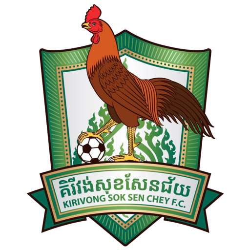
The new design is a dramatic departure from the ideas in the old crest. The dragon has been replaced with a rooster, the temple is gone but there’s hints that something interesting may be placed behind the rooster (with Khmer styled patterns involved).
The colouring has been changed to green and gold, which reflects the typical green home strips for the club.
Yet, as we note the great progress the brand has had – we couldn’t help but feel that the 2019 branding exercise left the club with a logo that still looks fairly dated. The style of the rooster is still very cartoonish and flat which seems to clash with the lighting effects on the shield and the simple background one-colour pattern.
As such, we decided to spend a few hours tackling the badge with a project sprint.
What is a Project Sprint?
A project sprint refers to the effort and activities used to determine and complete a project within an extremely short amount of time.
In this instance we aimed to rebrand Kirivong Sok Sen Chey F.C. in a single sitting over the course of 1 to 2 hours maximum.
The sprint approach supercharges the research, ideation, testing, and prototyping, to create a solution to the challenge/project at speed. As such, the end result may likely be subject to further development.
Why work with such short timelines?
The benefit of undertaking project sprints is to test our abilities to perform under pressure, produce results with incredibly short deadlines, and develop both rational and lateral problem solving abilities.
We won’t always publish work that is done so hastily, but we felt it’s great to share some of the results of internal problem solving exercises.
Clan United’s Kirivong 2021/22 rebrand.
We started by making the decision that we wanted the club to develop a strong identity. It made sense to keep the rooster as that is the image the club have opted for in a recent decision-making process. Step one was therefore to choose how to display the bird.
We opted to keep things clean, and minimal, as this is ideal for practical purposes (printing). There’s the added benefit that simple designs tend to be more memorable, adaptable, and recognisable.
The football is a useful symbol to include in the crest as it makes the brand’s purpose clearly recognisable. However, many other clubs use Rooster’s (and occasionally with footballs) so we wanted to make sure any decision we made with each element would portray a unique identity.
The name of the club posed some potential problem too, as including the full name in two languages would use up a lot of space and not look great if resized small (which would be likely at some stage of the brand roll-out). We researched the fan interaction with the club and found that most shorted the club name simply to ‘Kirivong’ in English. Having an English club name on the badge would make the club internationally recognisable and understandable, yet it was a difficult decision to remove the Khmer version as Cambodia rightly celebrates the language.
This was our result. We put a minimal, modern cockerel logo in the center of a typical football crest shape. We added an orange border to represent one of the club’s supporting colours, whilst leaving the crest background white (reflecting the away kit typical choice). It was important to include green as this was the club’s primary colour, so we added a bold stripe diagonally to the background.

We picked a bold timeless font to communicate the club name, before adding 2016 to the design to celebrate the foundation of the club. We were able to include the football harmoniously with the curved element of the rooster tail/feathers.

Further Tweaks and Mockups.
Testing the design is always important. We made some mockups, and put our new design side by side with the old design.
Our crest had the ball in white, which drew the eye, so we decided to colour the ball panels in green to stop it dominating the attention of the design.

We tested the design with a printed, textured mockup to imagine how it might be applied on football shirts. Then, we took this a step further by applying the badge to a realistic example of a player taking a throw-in:

