Design is largely subjective, even if there are various recommended “rules” or guidelines. As such, football kits can divide fans. Some particularly adventurous designs may carve a place in history, for better or for worse.
As a football enthusiast, I own what most would deem as “too many” football shirts.
Many of my collection are due to team loyalties, an overseas trip, or support for a particular occasion. However, some shirts are acquired purely for their aesthetic beauty or bold design choices.
Here’s some of my favourites from my collection, followed by some of my dream kits I’ve yet to track down.
Seattle Sounders 2021 Third Shirt
The Jimi Hendrix Kit. It’s bold. It’s unique. It’s paying homage to a key figure, rich in the history of Seattle (and indeed the world).

I grew up engrossed by music, in particular Guitar Virtuosos. So this kit release was a no brainer, I had to have it.
Purple is still one of the rarer colours to be sported by a team, and combining it with black always looks sleek in my opinion. The bold orange on the shoulders set this top off- the only adjustment I’d have hoped for would have been the vertical shoulder stripes of the previous MLS season…iconic!
Side note: My favourite kit colour scheme is vertical green and black stripes… And Seattle also sport this combo as their away shirt occasionally. I’m staying mildly neutral on the MLS, but I’m certainly a fan of their iconic Xbox sponsored shirt too.
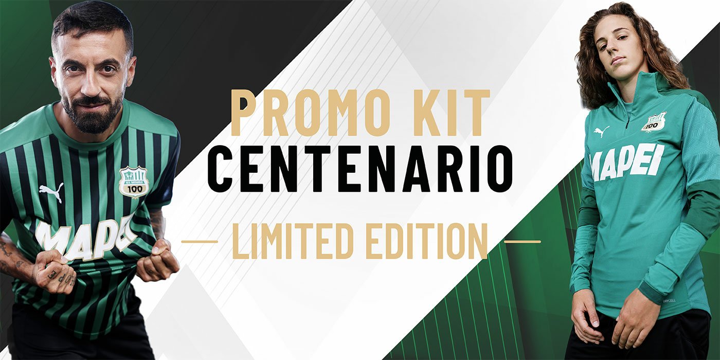
Sassuolo 2020 Home Shirt
I’m from Glasgow, which makes the chance of Sassuolo being off limits roughly 50%. However, I’ve enough green in my locker to clearly not be inflicted with such a setback—and just as well, the Sassuolo centenary top was exactly what I wanted for my collection.
As mentioned, this is my favorite kit identity. Green and black is bold, fresh, and powerful—and yet relatively uncommon and arguably unclaimed.
When you think of blue and black… It’s inter. With red and black the other half of Milan. White and black is Juventus, and Newcastle of course (albeit their global coverage is slipping due to performance).
Sassuolo have had some explosive performances in recent seasons, and could be set to be synonymous with this motif.

The 100 year anniversary kit celebrates the occasion with a bold “100” added to the crest. The stripes are thinner than I’d prefer, but the execution is great.
Yugoslavia 1998 Home Shirt
My earliest memories of international football are from 1998. Yugoslavia didn’t qualify, which is a shame because this shirt is a beauty. I must admit the country not existing now made the shirt more exotic to purchase.

Serious Pepsi vibes going on with the badge, which seems to have been changed at some point since the original printing of the shirt.
Nigeria 2018 Home Shirt
Not too much to say on this as over 3 million people also flooded Nike with sales. Clearly widely acknowledged as a beauty.

The create pattern reminds me a lot of chevrons, making me wonder if Hummel are furious that they didn’t produce it first…
Inter Miami 2020 Away Shirt
My other MLS purchase is the player fit Inter Miami shirt from 2020 (Away). There’s hidden embossed flamingos in black repeating on the body, that don’t always show up clearly in photos… But it’s a stylish addition.
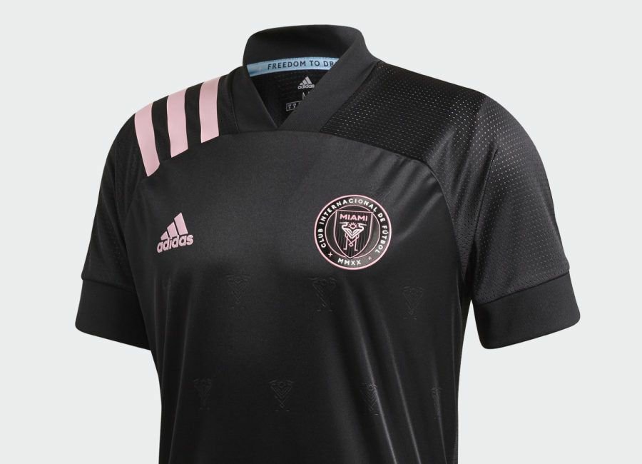
This was a mild battle to acquire as the 2021 version had already dropped, but I was adamant I wanted the three vertical shoulder stripes.
I showcase this shirt often for the crest. It’s a modern club, and they’ve invested in branding. The crest combines multiple elements typical in football logos, while ensuring the club identity is clean, concise, and aesthetically pleasing.
Palestine 2020/21 Home Shirt
Took a while, but this grew on me. Bold colours set on white, quite the head turner on the pitch. As with so many national shirts, there’s a bit of “painting by numbers” whereby the flag is thrown on to the top in a creative way each year.

UNAM Pumas 2011 Away Shirt
The shirt sponsorship can often clash with the huge Pumas logo to make these shirts feel more like ice hockey jerseys. However, I absolutely love this one, my copy is falling apart from the amount of wear it’s gotten!

Only fitting that Puma would be the kit provider too!
Chapecoense 2016 Home Shirt

After the tragedy in 2016, I purchased a top out of respect. It’s a conversational prompt to honour those affected, and a stark reminder of the greater importance beyond the pitch.
Berwick Rangers 2020 Third Kit
Including this one for obvious reasons. It’s a proud moment as the first Clan United design was used on the pitch.
Our design for the club crest was considered and repurposed to launch the Berwick Rangers community foundation. The community crest then featured on the sleeve of the third strip.
Also, to support the black lives matter movement, the club badge was featured in black out of solitaditary—making this kit a poignant reminder to the public affairs of the time. There’s also a secondary charity foundation on the opposite sleeve, the Chris Mitchell Foundation.
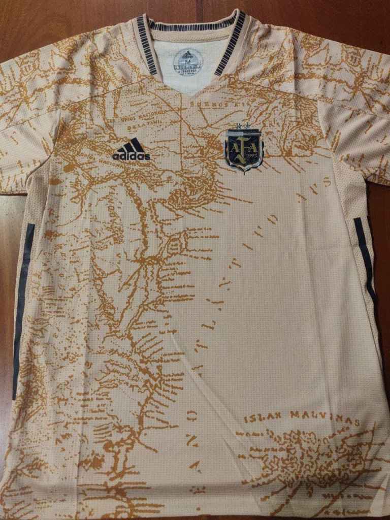
Argentina 2021 Concept Shirt
Having visited the production lines used for premier league tops, I was given great insight into the requirements for printing. My mockups therefore usually include feasibility factors… meaning the single image prints are less common from Clan United.
However, when shirts do these designs well, they’re brilliant. I was able to get my hands on a concept shirt made for the Argentina home team, would love for this to be used by the team one day.

Golden tones, and a map of Argentina etched across the whole shirt. Glorious.
I’m still bewildered how I managed to get such a rarity, I’m partly convinced the designers didn’t even try printing it as no printed prototypes were shown online at the time of writing this.
Iceland 2016 Home Shirt
A great euros campaign, a memorable thunderclap chant, and a nice minimal kit.
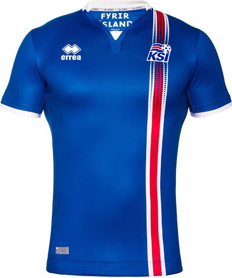
English readers probably won’t agree with me on the beauty of this one. And it’s only now that I’m reminiscing that I’ve spotted one of my Raith Rovers kit designs suddenly no longer feels novel.

Which leads nicely on to another Euro piece of history…
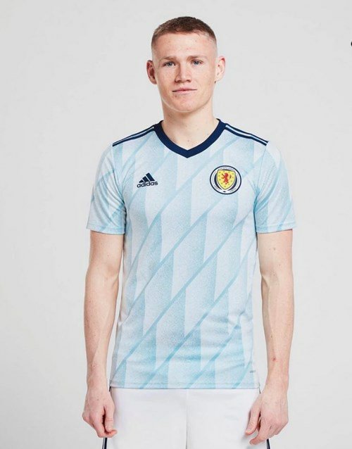
Scotland 2020 Home and Away Shirts
The first time Scotland qualified for a major competition in my adult lifetime. Of course I got both.
I’ve fallen in love with the style of the cuffs on the home shirt. Seen across many adidas strips in 2020/21, these chunky cuffs give the tops a nice edge. Almost surprising Adidas didn’t attempt a third stripe of colour.
Everton 2012 Third Shirt
This may seem unremarkable to many, but it’s got a place in my heart. 2012 was a pivotal year for my interest in football. I remember it being the age where I wanted to immerse myself in watching and playing as much of the sport as time could spare.
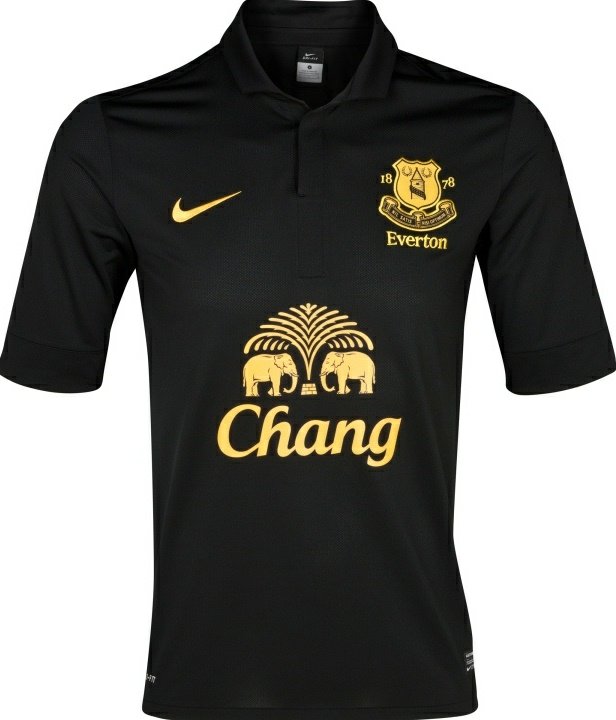
Even then, design was important to me. I’d decided supporting a premiership team would make watching the league more exciting. I’d found Everton to have noble routes and be earnest yet capable of exciting football… Not quite underdogs but also not expected to win anything (sadly).
I spotted their third strip, minimal and sleek- one of the few black strips that season I believe. It became my weekly shirt for 5 asides, and my love for football has only grown tenfold since.
(I’d probably add a Falkirk shirt here too, with a picture of me aged 8 wearing it…but I’m not going to).
The wish list.
This section is a homage to shirts I love. I’ll supply the reasoning, as sometimes it’s not as simple as “it looks pretty”.
As my kit collection is now half way to 100, I’m sheepishly considering calming down impulse buys. However, these are the shirts I’ve got my eye on:
Real Kashmir 2021 Home Shirt
After discovering this team through a documentary, I’ve became fascinated with the progress of the club and their Scottish manager.

Absolutely no luck finding one of these, and travelling there doesn’t look likely any time soon.
One day.
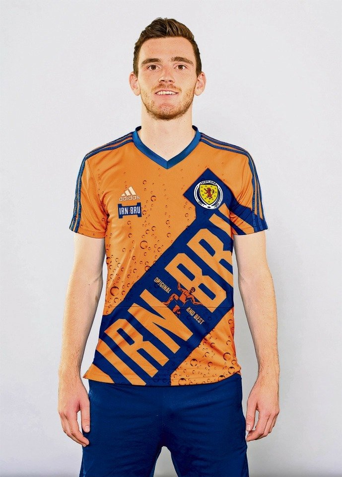
Scotland Irn Bru 2021 Concept Shirt
Yes I know it was an April Fool’s joke. But no, that doesn’t make me want it any less.
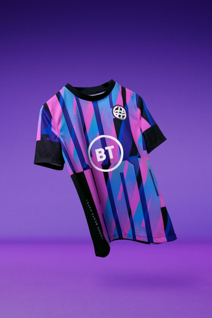
Hope United 2021 Concept Shirt
Backed by some big names in UK football, this kit launch has a social mission. Also helps that I love the design.
Forrest Green Rovers 2019/20 Home Shirt
The home kit has been in and out of my shopping cart a few times. It’s a vegan-friendly kit with a striking design that looks like it’d glow in the dark.
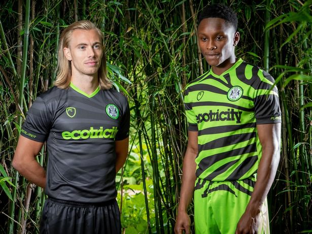
It’s certainly unique, and that can often be a great thing. From memory, it had a fairly positive overall reception, giving the club a lot of additional hype.
Phnom Penh Crown FC 2018 Third Kit
Even tracking down a photo of this shirt proved difficult. However, I’m still residing in Phnom Penh, so I’ve kept faith of another chance to purchase it.

The shirt embodies a lot for me. It reminds me of my passions and my individuality. When given the opportunity previously, I didn’t buy the shirt…I thought it was ok, but wasn’t overly enamoured. Yet, over time various aspects of the design have appealed to me more.
Firstly, they’ve been a local team for me for a few years now. The club underwent a rebrand by a local design agency that I worked with as Head of Communications for a year too—their work being how I discovered them.
The shoulders are particularly modern in design, and the provider is based here in Cambodia… Even the sponsors remind me of daily life. I’ve came to the realization that such a shirt will likely pack much more emotion to me than the club behind it.
Orlando Pirates 2020/21 Home Shirt
The logo was already great, and I had my eye on their 2017/18 home shirt for a while too (it features the three bold shoulder stripes and a centred crest)… but the simplicity of last season was a bold statement.

The away shirt in orange sold out in hours, but I must admit I like the black and white. Simple. Although, I’ve a pet peeve of having to wear a bib during 5 asides (therefor covering up great shirts)… the orange shirt would be permissible in place of the bright orange bibs we often use!
Vasco Da Gama 2021/22 Respeito e Diversidade
This is stunning.
As a football shirt, it ticks so many boxes for me.
There’s simplicity involved, yet creativity. The badge is extremely minimalistic yet iconic, and the supporting kappa logo is always cool to see. The collar and cuffs give the top extra personality, whilst the rainbow design is excellently executed without it feeling overkill.

Ultimately, the shirt is about more than design. It is a statement about the importance of respecting diversity, and a sign of support for LGBITQ+ rights.
Forward Madison 2020/21 Third Shirt (‘The Drip’)
If you haven’t heard of Forward Madison, and you love football kits… go check out this club.
They’ve released so many creative designs that blur the lines between convention and fashion. Their third kit from 2020/21 made a huge splash and the club acknowledged their commitment to maintaining a high standard of exciting football kits in the future.
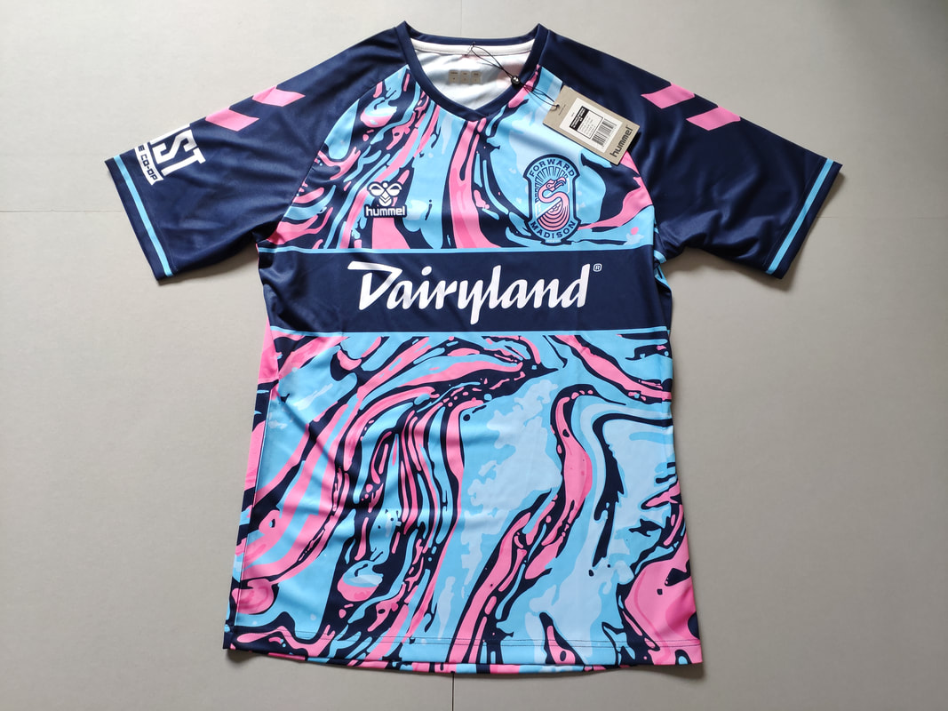
Everything about this design screams Miami sunset parties and chilled oceanfront vibes. Absolutely love it.
Notable Mentions – Inventive Football Kits
The final section of these piece will cover some…interesting…choices. Some of these I absolutely love, some I absolutely hate. However, they’re all noteworthy for various reasons and would surely be head-turning gems in any kit collection for their sheer novelty and uniqueness.
As a side note, I do try to avoid simply covering the same top teams and their every release. Big teams equals big budgets equals (hopefully) great quality releases…or at least the quality performances wearing them.
Here’s some of my choice picks for 2021/22:
Bayern Munich 2021 Third Kit

I know I said I would avoid the ‘big teams’/usual suspects, but this third kit is a delight.
Corinthians 2021/22 Home and Away Shirts
Kudos to a team committed to making both shirts quirky. It can be a bit of a gamble, but personally speaking I quite these. Nice and simple, yet signs of inventiveness.
RB Leipzig 2021 Home Shirt
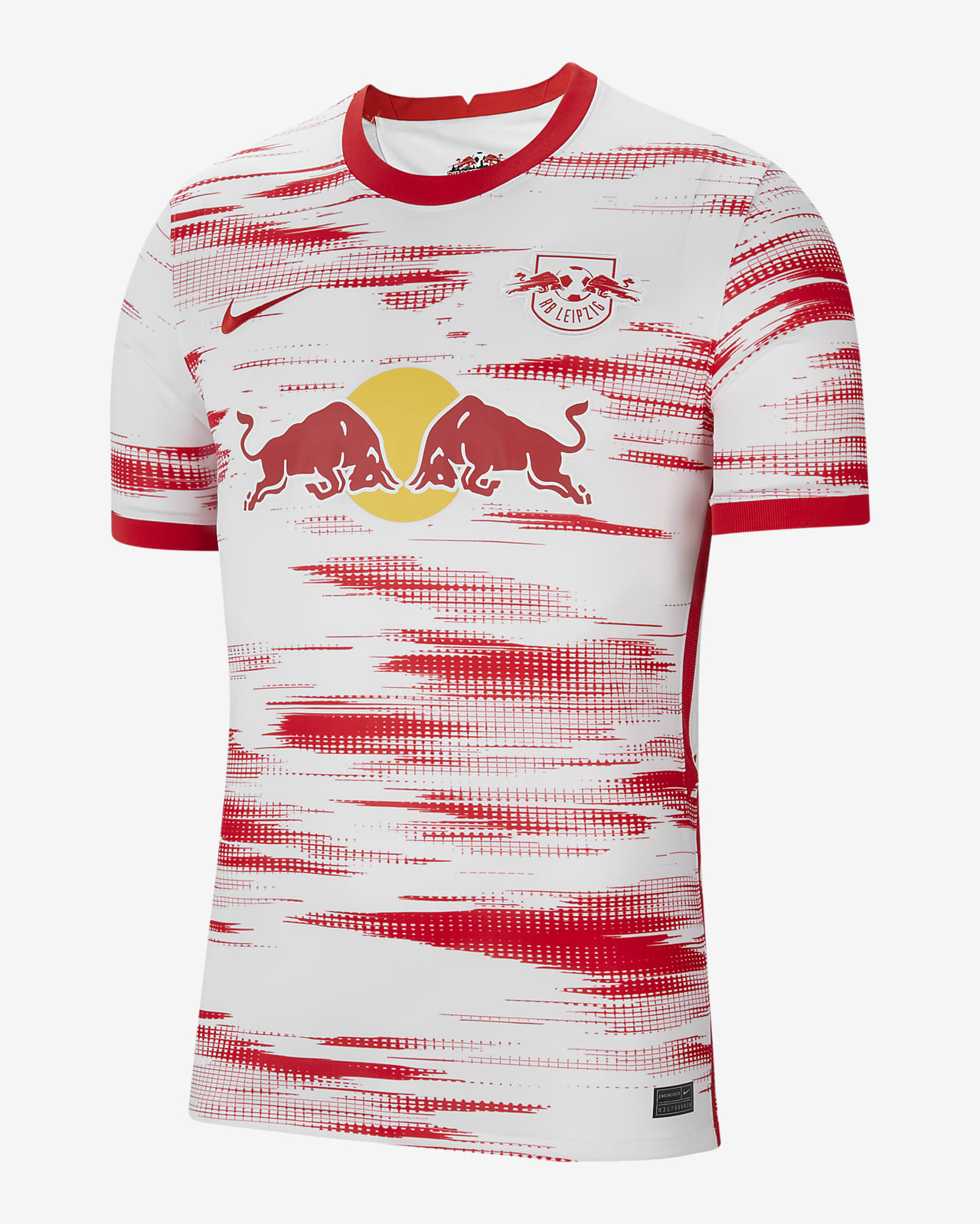
I’d imagine this will also be highly featured on new shirt roundups. The modern style of the design will surely suit the speed and intensity of the RB Leipzig play styles, those ‘blurs’ certainly remind me of speed, will be interesting to see it on the pitch.
Gamba Osaka 2021/22 Home and Away Shirts
The Japanese side have launched their new home and away kits, and both are eye-catching. The home shirt has taken the simple concept of black and blue stripes and thrown some go-faster chevrons into the mix. There’s a lot going on with the Daicel sponsor added, and the 9 stars above the crest.

The away shirt is still aiming to turn heads, and in my opinion it’s executed better. The break in the pattern allows the Panasonic logo to blend nicely with the shirt, meanwhile Daicel is less offensive as it loses the awkward block around it.
Cheltenham Town FC 2021/22 Third Kit
This top is getting included for the gesture behind it, rather than the design. The red and white style makes it appear fairly ordinary at first, but on closer inspection you’ll see a huge list of names all over the shirt. These names belong to the season ticket holders of 2020/21 that waived a refund of their season tickets (during the COVID-19 disruptions) to help support the club.

I’d be more than delighted to have my name on my team’s shirt like this, classy gesture.
West Brom 2021/22 Home Kit
At first glance I thought West Brom had simply brought out a nice, yet simple home design. I much prefer this style compared to the busier stripes of last season, and the red touches on the cuffs, shoulder, and collar work well (as does the puma logo).
However, on close look, you’ll notice text all over the main blue section of the body…
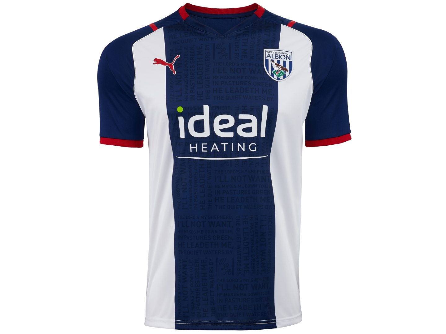
The words are the lyrics to their club anthem ‘The Lord’s My Shepherd’. Inventive.
SC Freiburg 2021/22 Home Shirt
Instead of looking at this as another animal print inspired shirt, apparently we should think of their crest.
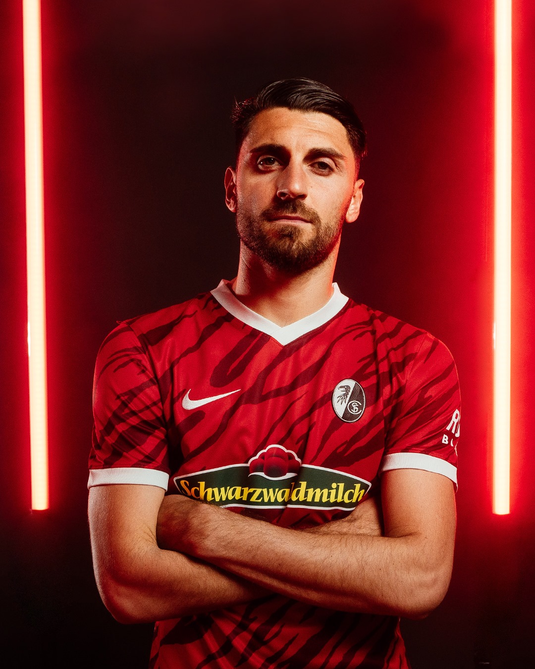
Apparently the darker red shapes are to represent ‘griffin scratches’. Nice idea.
The hilariously long German word as the sponsor tickles me, giving almost zero doubt about where the team play.
SpVgg Greuther Fürth 2021/22 Home Shirt
Sticking with Germany, the newly promoted side SpVgg Greuther Fürth have quite an unusual pattern for their home shirt. The puma logo blends in with the patchy two-tone green camo swatches on white. Unsure what to make of this one.

Forward Madison 2021/22 Home Shirt
I’ve got their 2020/21 third shirt on my wish-list, and I mentioned the club publicly acknowledging that their previous design standards have been so high that they know they need to maintain them.
So… given that they’ve set a high bar, it’s time to consider whether 2021/22 kits are good enough.
Their home shirt has three main styles blending together. I like the white stripe on baby blue. The navy sleeves are a nice supporting shade, and finally the additional pattern throughout the baby blue mimics the typical chevrons that hummel are known for. A lot going on, but nicely done.
/cdn.vox-cdn.com/uploads/chorus_image/image/69243732/FINAL.00_00_24_01.Still008.0.jpg)
Does it make it straight on to my wish list? No.
But, it’s a nice shirt and I’m confident the away top and third top will be equally thoughtful from a designers point of view.
