Towards the end of 2021, a new organisation was established to replace the ‘Metfone league’ in Cambodia, with a professional domestic league that would mirror international standards. One of the central aims was to communicate that Cambodian football is a serious, competitive, and exciting competition that strives to be on the same level as some of the region’s most renowned leagues.
Clan United was approached by the league to pitch for the corporate identity and branding of multiple league assets such as various tournaments/cups and the various league tiers.
Our Approach
We aim to involve the audience and all key stakeholders within our process. We follow the universally recognised ‘double diamond’ approach to ideate meaningfully and create designs that will resonate with the core beneficiaries to all projects—in this case the Cambodian football fans were to be central to the brand identity creation.
The first stage of the process is to research: We looked at global league standards for our best practices/desk review, and also spoke to various Cambodian football fans to get some qualitative insights into their views on the sport.
Secondly, we narrowed our focus to define exactly what approach we believed would be most effective. In this instance, we found that certain league brands held more gravitas and excitement to Khmer people than others—and especially due to a love of particular global superstars such as Messi and Ronaldo, fans followed European leagues and interpreted those leagues to be the world leaders of professional football.


Next, we entered our ideation process and created multiple design routes. We quickly tested our design prototypes with our target audience for immediate feedback and pivoted towards developing one particular impactful route. Our decision was to embrace the ‘anamorphic’ route, and use an animal as the core brand symbol/logo, whilst having an accompanying wordmark.
We decided to use the ‘Kouprey’, Cambodia’s national animal (and also the nickname for the national team) as a bold, proud logo.

The final stage of this process was to package up our prototype as a high-fidelity mockup, and build it out with various adaptions to support our decision. We used the colours of the flag, and added Kbach Khmer pattern to the wordmark to add some bespoke national style to the design. Another consideration was how the design could be adapted to suit each team in the league—we found that the bold block logo style was effective in being permutated to individual team colour schemes.


On the 10th of February, an alternative design was chosen by the CPL, but our full pitch is available via the following slide deck: Click here to view our whole pitch.
CPL’s chosen route (other agency)
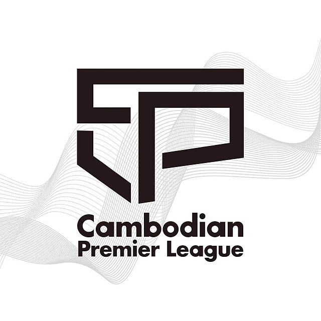
This is the current CPL design:

Whilst the design is certainly modern, one consistent fan criticism has been that the brand does not give enough emphasis on the lower tiers that technically shouldn’t incorporate the P (‘Premier’) in the design. Some fans also highlighted that the simple nature of the design does not feel Khmer or noticeably represent the country. However, one cool feature of the chosen design is that the designer shaped the letters into the Cambodian country geographical shape.