
What is the A-Z Kit Design Challenge?
Quite simply, we challenged ourselves to design a football kit for at least one team per letter of the alphabet.
This was to keep us active, whilst discovering and learning about clubs that we may not have previously been looking at.
All designs are conceptual mock-ups that were shared via our Instagram account (clanutd).
A: Aberystwyth Town Football Club

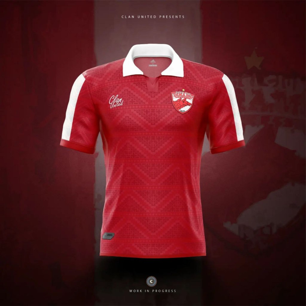
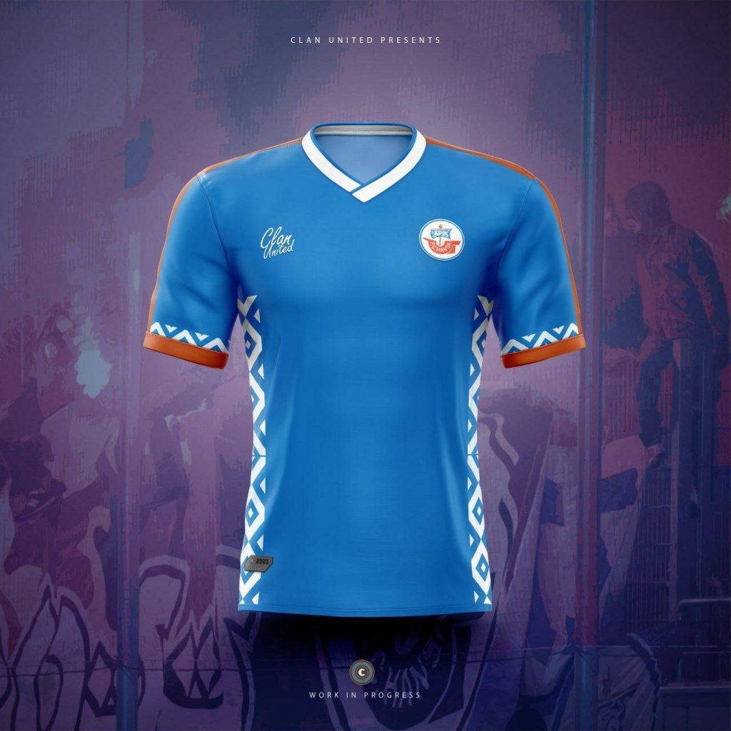
B: Buriram United

C: Celtic Football Club
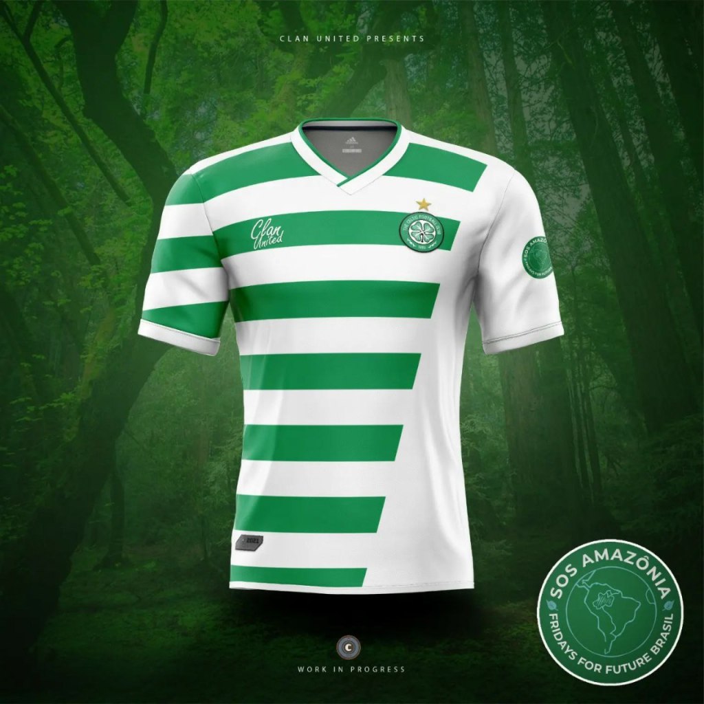
As a club known for charitable roots and causes, with a fan base backing the noble work of the Celtic foundation- it felt fitting to create a concept that tied into a noteworthy support.
Fans tend to say the hoops shouldn’t be broken, so scaling back the green hoops is intended to mirror the deforestation and lack of “green” efforts needed to fully combat various environmental causes- as an example, #sosamazonia has been selected as a great campaign to support.
D: Dinamo Bucharest

Alternative design:
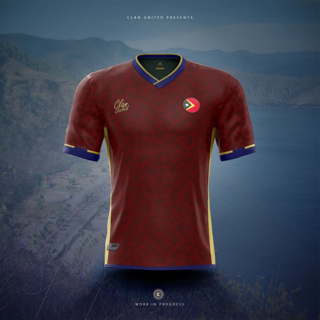
E: East Timor / Timor-Leste
F: Fenerbahçe FC.

The yellow and blue stripes have created quite an iconic look—so for this kit concept we’ve created a goalkeeper shirt to humbly sit behind the stripes.
G: Guangzhou Football Club
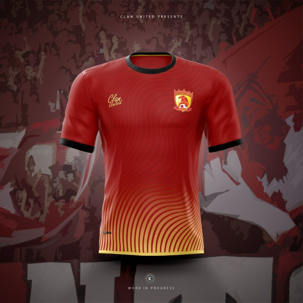
Formerly known as Guangzhou Evergrande Taobao Football Club, is a professional Chinese football club, we highlighted their bold red with high contrast black cuffs and collar, and celebrated their colour scheme with a sunburst fade.
H: Hansa Rostock
I: India National Team

Whilst there were so many opportunities to use bold, colourful, and uniquely Indian patterns on this concept — we opted to keep the kit clean by using an outline-only version of a paisley styled floral print. Accompanying stripes and dashes add the national identity via the flag.
J: Japan National Team

After the roaring success of the highly inventive waves design, and anime design, Japan released a simplistic anniversary shirt. Drawing from this move from highly conceptual to simplistic, this minimal design keeps things clean and modest
K: Kirivong Sok Sen Chey FC
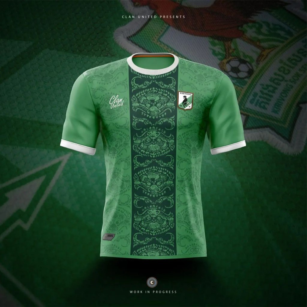
After our previous badge redesign concept, we’ve decided to pick this Cambodian premier league side for a striking kbach inspired design.
Keeping the clubs core colours, we introduced a darker green streak to catch the eye and highlight this unique Khmer pattern.
L: Laos National Team
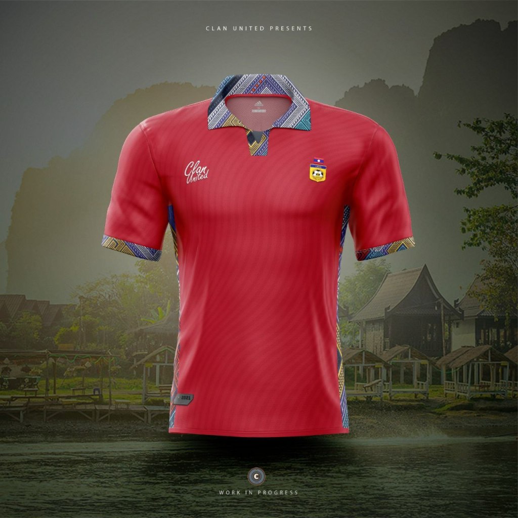
Keeping the bold red identity was a key consideration – but doing something eye catching that celebrated the culture was an ideal aim. We found traditional Laotian patterns to use on the cuffs, collar, and as a highlight on the side of the shirts – breathing life and history into this design.
M: Manchester City

Manchester City third shirt concept. Celebrating the Irwell, the Irk and the Medlock—the rivers that flow through Manchester and are traditionally represented by the three lines under the ship in Manchester city crest.
N: Nashville SC
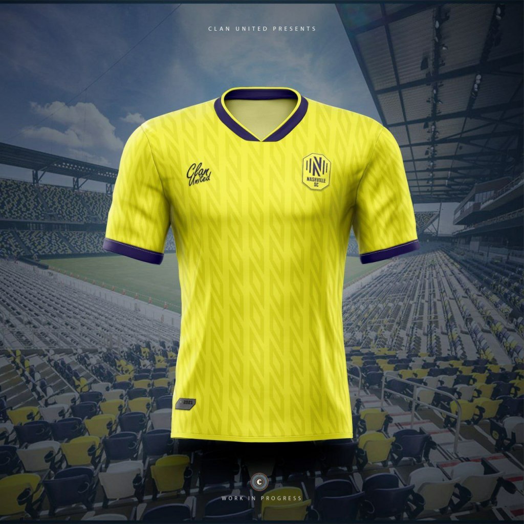
Nice simple concept for this, simply taking the N V (Nashville) shapes from the crest to create the repeating pattern.
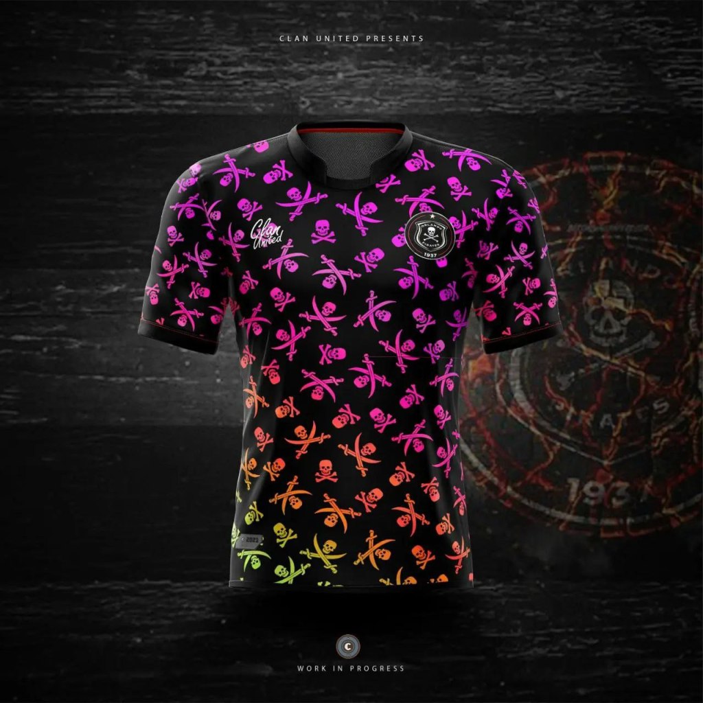
O: Orlando Pirates
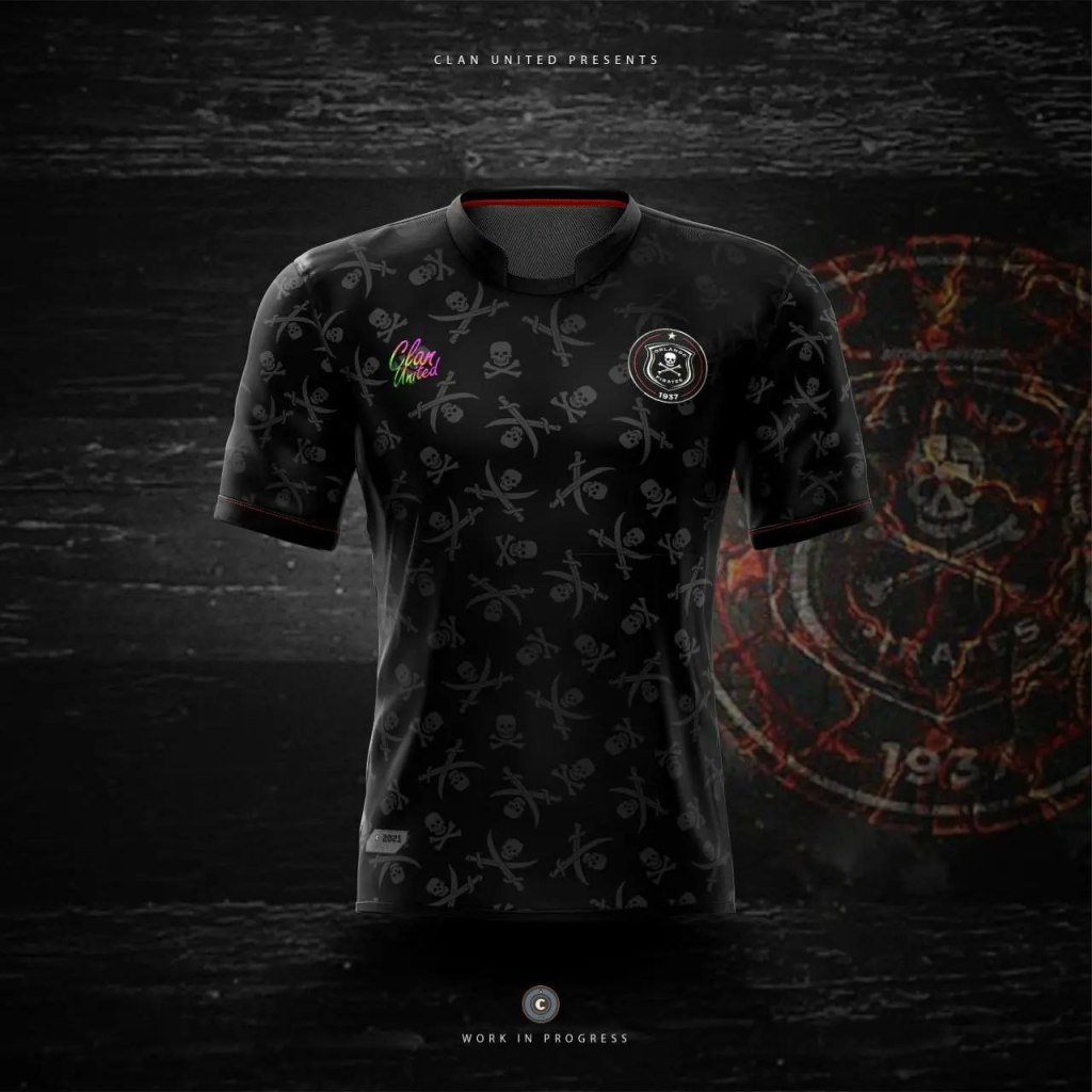
The recent adidas shirts were brilliant, they simplified the badge to just the skull and cross bones, and it worked. However, this might be a short term gimmick, so this concept brings back the full crest – and builds on the previous kit design. There’s a second consideration thrown in just to turn heads, which definitely won’t be for everyone- mixing it up from plain back with neon colours.
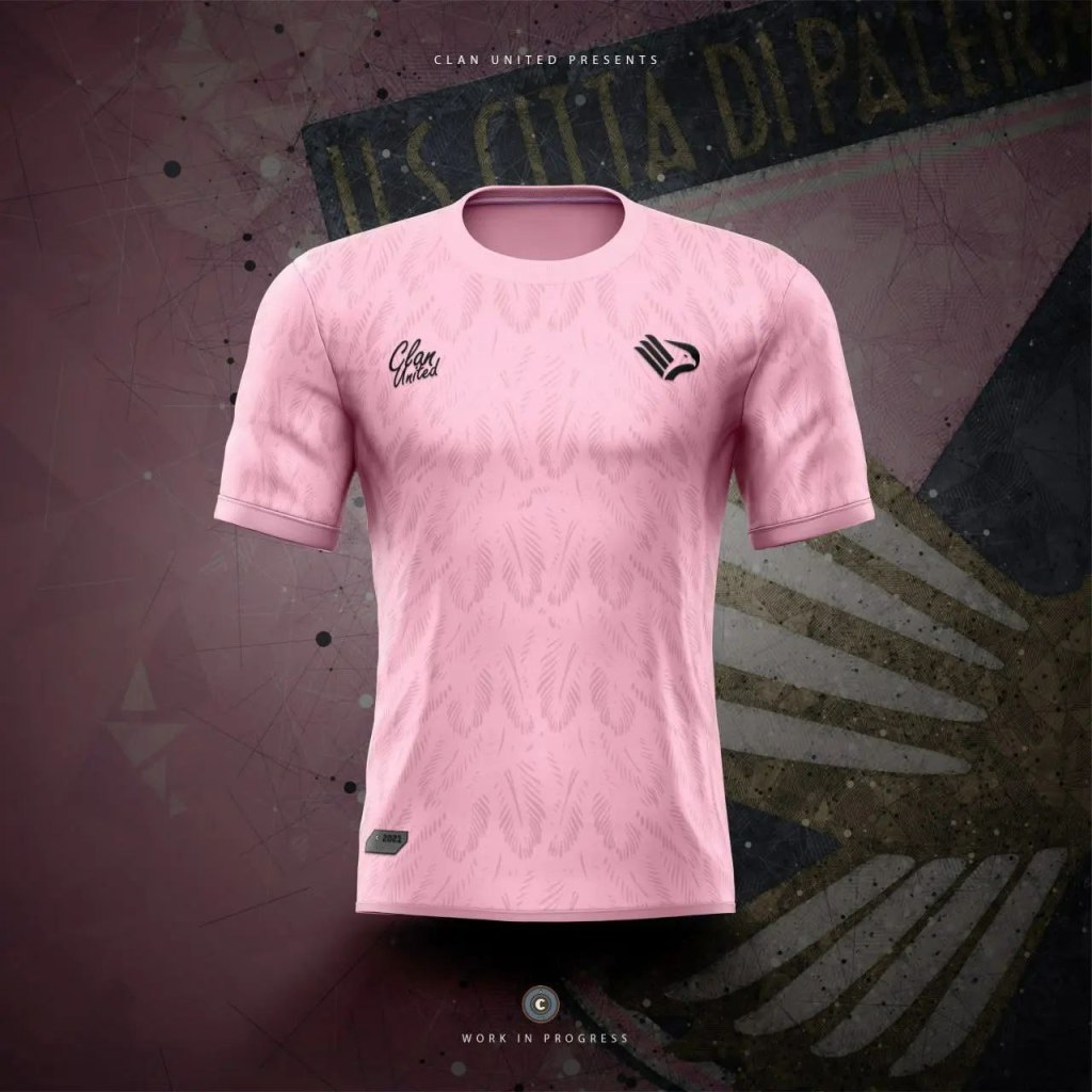
P: Palermo
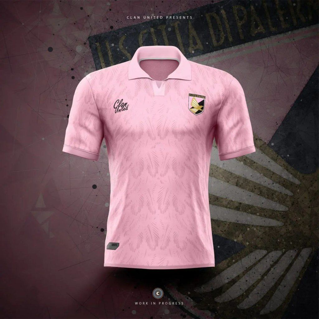
There’s two versions of this concept design here… One with the old crest, and one with the new. The old crest was brilliant, and the change wasn’t necessarily met with praise. The shift between classic and modern is always a tumultuous journey for clubs and their fans… So we wanted to honour both crest designs with this concept shirt.
The pattern is based on the eagle that is central to the club’s badge – keeping the iconic pink home colour all over.
Q: Queens Park Football Club
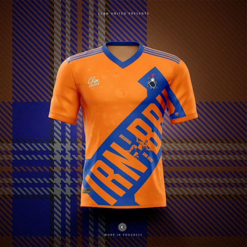
Queens Park are sponsored by Irn Bru, and we’ve been tirelessly waiting for the SFA fake kits (April fool’s) to actually be made… So we decided to take matters into our own hands and recreate the kit for Queens Park instead.
Very subtle differences to fake design, but we’d certainly love it as a collectable.
R: Rangers Football Club
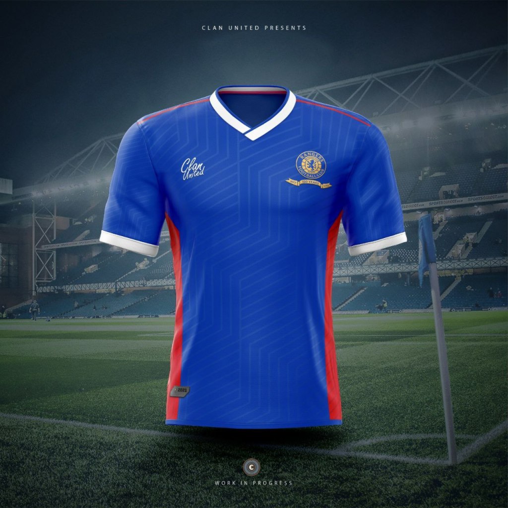
After a huge Europa League run for the club, it only felt right to include Rangers as the entry for R. The design brings back extra flashes of red down the side of the shirt, and along the top – and adds a subtle but unique texture through the design giving the appearance of a slight shine – complimenting the gold celebratory crest.
S: Scotland National Team

Doubling down with Scottish kits, we’ve used the SFA tartan, and revisited some retro adidas styled vibes at the top of the shirt.
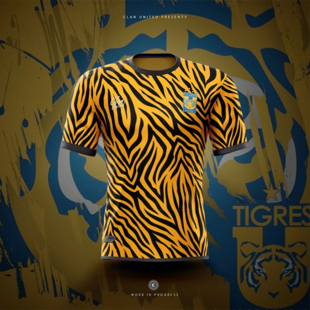
T: Tigres UANL
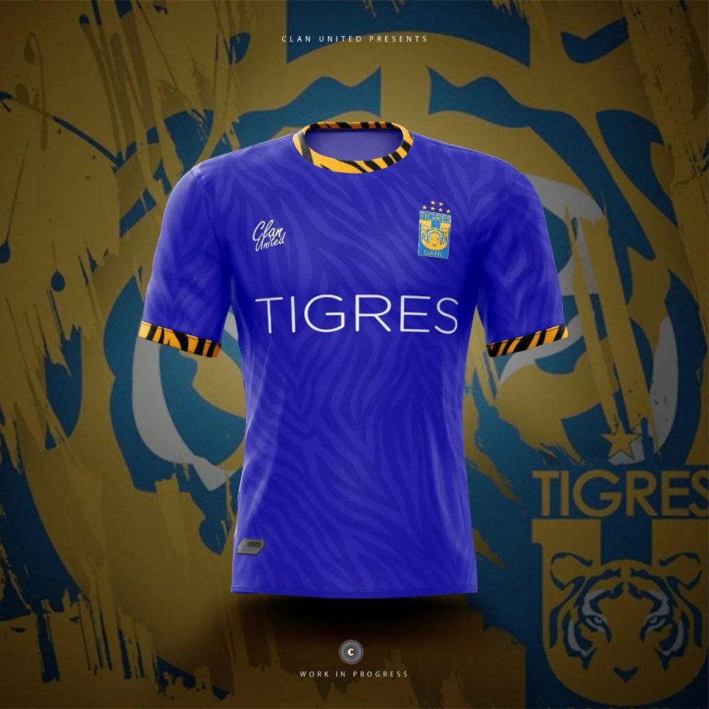
Seemed far too obvious to do a tiger pattern, so additionally a blue away shirt has been prepared. Tiger king vibes.
U: Ukraine National Team

There’s an ongoing debate about whether “politics” belongs in sport—but it’s our belief that major platforms for positive change should indeed be used. We stand with Ukraine.
V: Vitesse

Whilst Vitesse may have traditionally started out wearing blue, their switch to yellow and black (due to Reinhard Jan Christiaan baron van Pallandt) has cemented a bold, recognizable football brand.
W: Western Sydney Wanderers FC
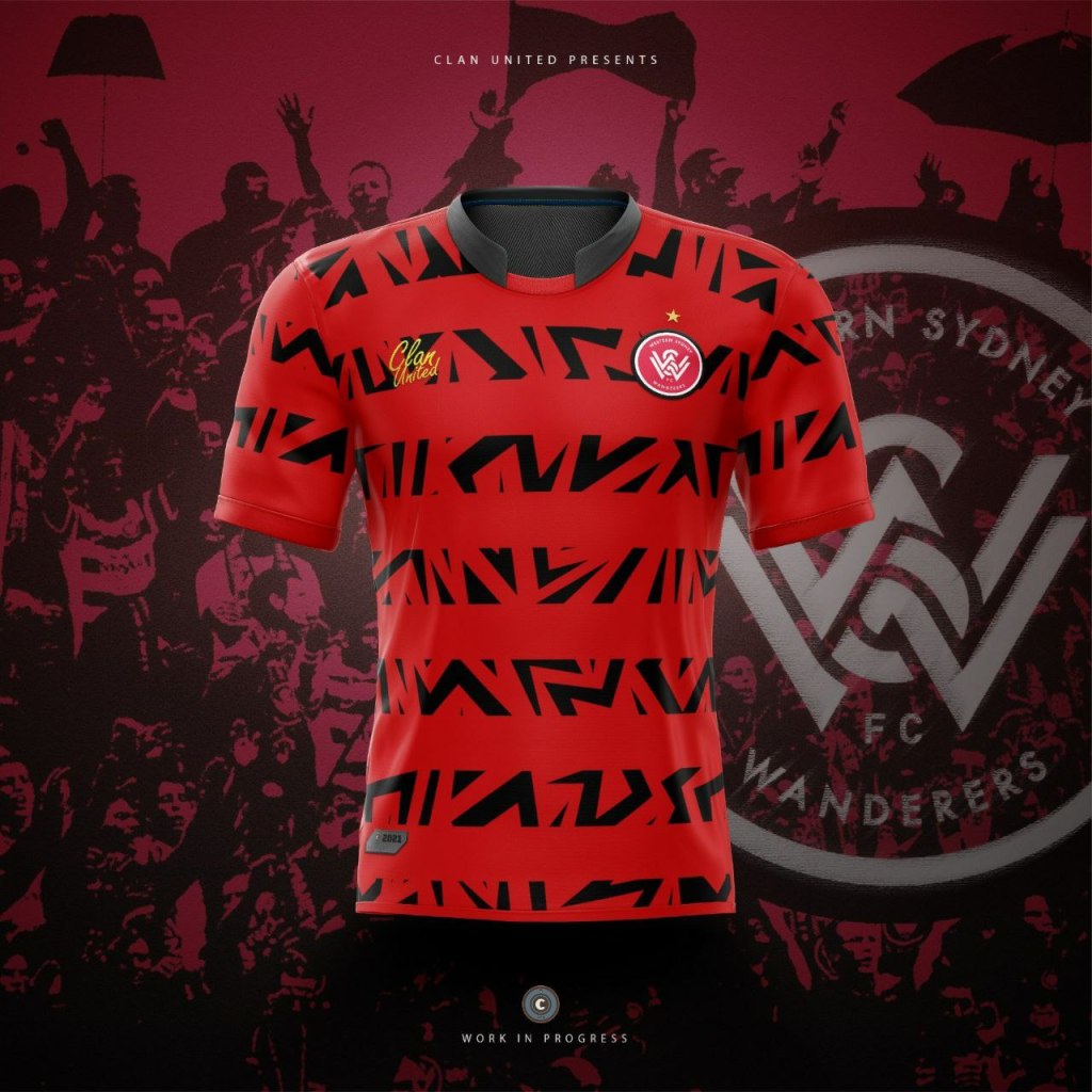
As the end of the design challenge approaches, it made sense to go more conceptual again. This design doesn’t shy away from adding a more striking twist to the previous red and black hooped tops that WSWFC have released.
X: Xerez Club Deportivo

Delving into the history books to learn about this club, Xerez seems to originally be named after the Sherry (Jerez) export trade (Spain-UK). This away concept shirt originally was designed to be clean, and bold… Before the decision to add tattoo styled sleeves made the design come to life in a much more unique way.
Y: Yeovil Town F.C.
This concept shirt could potentially cause havoc with any green screen technologies – but we’ve created a modern kit that would catch the eye on the field.
Z: Zurich football club
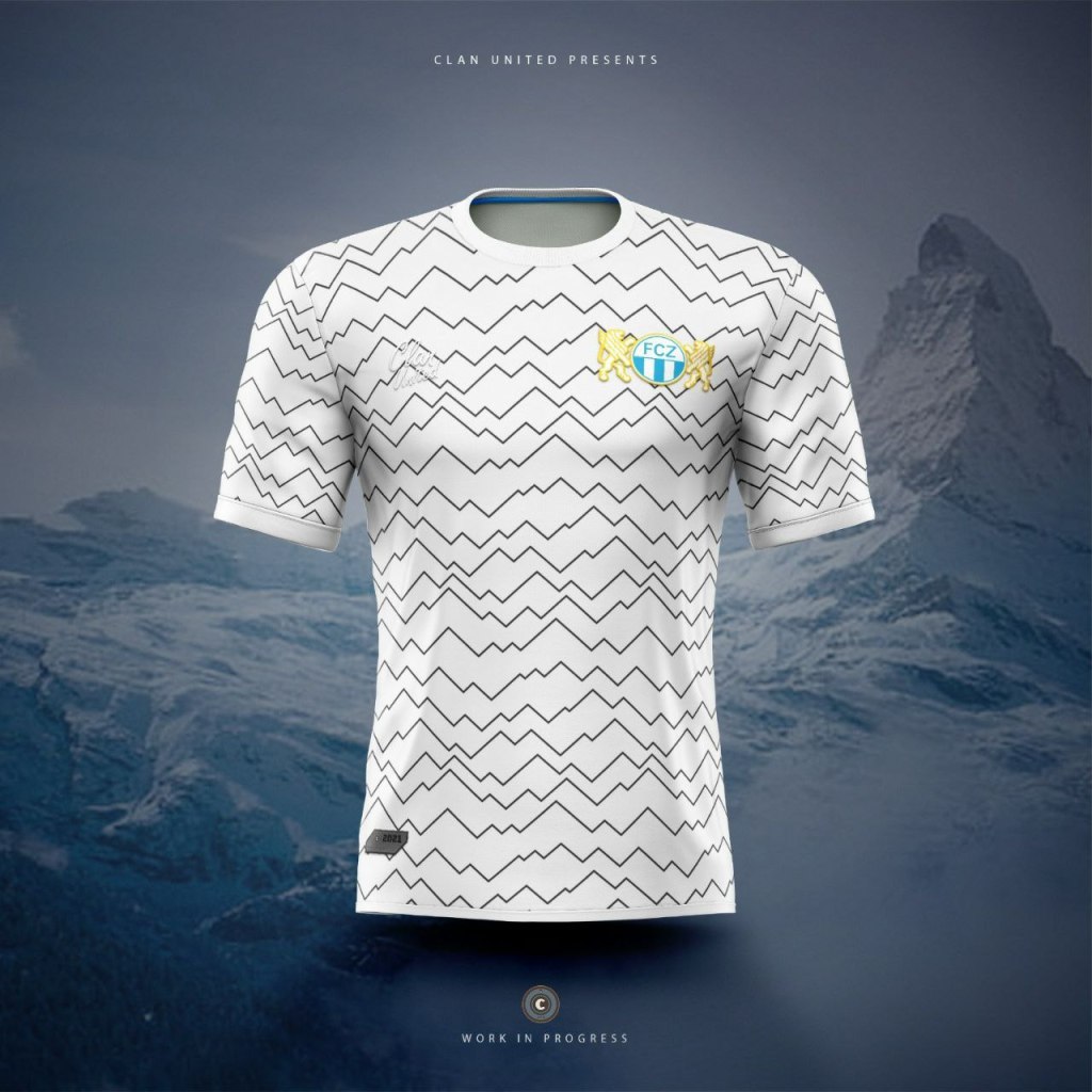
Last but not least, inspired by Switzerland’s mountainous geography, the FCZ shirt has a simple striped pattern to reflect the many peaks within the country. Had we not already made a topology kit pre-challenge, that would have been the second consideration!
Topology Reference design, Bokor Seniors:

Commission a Kit (or Football Design)
Clan United is dedicated to bringing HCD to Football, by using Design Thinking we want to keep the beauty in the beautiful game.
If you want to create a new identity for your club, whether that’s the branding/identity, kits, or a particular corporate item or digital asset, then don’t hesitate to get in touch.
Learn more via our About Us page. You can also use the contact us form on that page to get in touch directly.
